Today, I would like to do an intraday analysis of the AUD/CAD. What caught my eye here were two things. First, strong buying activity (uptrend). Second, rotation areas created within the uptrend. There are usually heavy volumes traded in rotation areas like these so I used my Flexible Volume Profile to check them out.
What happens when there is such a heavy volume area created in an uptrend? This usually indicates that strong buyers were adding to their long positions there (in the rotation areas) and then pushing the price even higher.
When the price makes it back to these levels again (in a pullback) then those strong buyers will most likely defend their longs and they will push the price upwards again. This is what I expect to happen at those two heavy volume levels.
If you look at the first one, then you can see that it actually got tested today in the Asian session. There was a fast and precise reaction to it. This makes this level spent and I don’t really expect any more reactions to it. Well, in fact there could be another reaction to it but the chances are lower now…
The second level at 0.8546 is still intact. It hasn’t been tested yet and I expect a buying reaction from it (when there is a pullback).
Below is the AUD/CAD chart; 30 Minute time frame:
Significant volume areas
The Volume Profile shows two significant volume areas here. The first one at 0.8629 and the second (the lower one) at 0.8546.What happens when there is such a heavy volume area created in an uptrend? This usually indicates that strong buyers were adding to their long positions there (in the rotation areas) and then pushing the price even higher.
When the price makes it back to these levels again (in a pullback) then those strong buyers will most likely defend their longs and they will push the price upwards again. This is what I expect to happen at those two heavy volume levels.
If you look at the first one, then you can see that it actually got tested today in the Asian session. There was a fast and precise reaction to it. This makes this level spent and I don’t really expect any more reactions to it. Well, in fact there could be another reaction to it but the chances are lower now…
The second level at 0.8546 is still intact. It hasn’t been tested yet and I expect a buying reaction from it (when there is a pullback).
Below is the AUD/CAD chart; 30 Minute time frame:

Resistance turns into a Support
There is also another thing I like about this 0.8546 level. The thing is that it worked as a resistance in the past – the price bounced twice off this level. I marked this in the picture above. When the price went through this resistance, it then became a support. This is a simple Price Action setup which I like to use. More about it here:Resistance turns into a Support SETUP
So, not only we have the Volume-based setup but we also have a resistance→support setup which confirms the 0.8546 level.
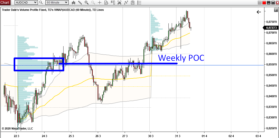
Weekly Point Of Control
That’s not all! There is one more confluence to all this. This confluence is on a Weekly Volume Profile. This Weekly Volume Profile tool shows how the volumes got distributed throughout the whole week. The picture below shows a Weekly Volume Profile from the previous week (the profile on the left). As you can see, the Point Of Control (= place where most of the volumes got traded) was just a bit above our 0.8546 level.Pretty cool, right? This adds one more confluence to our level!
Weekly POC is definitely a very important place in any chart. Every institutional trader who works with this or similar time frame knows where the weekly POC is. And so should we!
Below is the AUD/CAD chart; 60 Minute time frame; Weekly Volume Profiles.
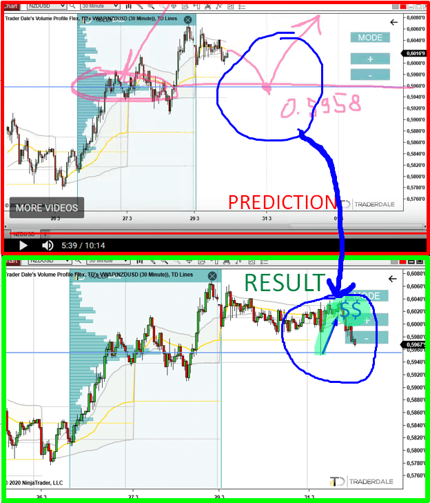
NZD/USD level
Did you watch the Weekly Trading Ideas video I made yesterday? If not, you can watch it here:How to Adjust Your Trading To High Volatility
The picture below shows a strong level on NZD/USD I showed you yesterday and then today’s reaction to it. The setup behind this level was the same as the setup I was talking about in this article. I call it the Trend setup and you can learn more about it in this webinar recording:
Volume Profile Webinar: Learn How to Trade Forex Using Volume Profile
I hope you guys liked today’s analysis. Let me know what you think in the comments below!
Stay safe and happy trading!
-Dale
Stay safe and happy trading!
-Dale
- Get link
- X
- Other Apps
- Get link
- X
- Other Apps
Comments
Post a Comment