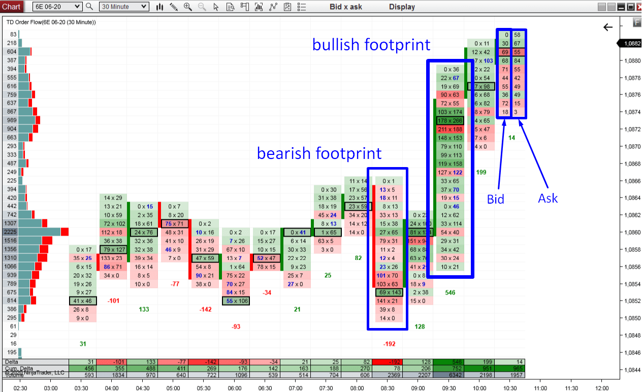
Beginners Guide to Order Flow PART 1: What Is Order Flow?


DEFINITION: Order Flow is an advanced charting software which enables you to read all trading orders that are processed in the market. It helps to track the BIG financial institutions through the trades they make.
Most people get confused when they open up a chart with Order Flow for the first time. There is no shame in that. Order Flow shows so many information and it is easy to get overwhelmed and confused if you don’t know what to look for!
This Beginners Guide will teach you how to understand how Order Flow works and how you can use it in your trading!
In this 1st part of the Order Flow Guide I will show you around the Order Flow interface.

Footprints

The Order Flow does not show standard candles, but it shows FOOTPRINTS.
A footprint shows not only Open, High, Low, Close (as standard candles) but it also shows orders traded in that candle.
Orders can be placed on Bid or on Ask.
When a BUYER enters a long position (with a Market order), then his order shows on the ASK side of the footprint.
When a SELLER enters a short trade (with a Market order), then his order shows on BID.
This is how the Order Flow chart is drawn.

Green/Red Cells

Inside every footprint there are green or red cells.
The cell is GREEN if the number on Ask is bigger than on Bid.
It is RED when the Bid is bigger than the Ask.
This represents the strength of Buyers versus Sellers.
For this reason, the bullish footprints are mostly green (stronger buyers) and the bearish footprints are mostly red (stronger sellers).

High Volume Nodes

Possibly the most important place in any footprint is the High Volume Node. It represents the place where the heaviest volumes were traded.
It is marked by a black outline so it is easily visible at first sight.
If there are more Heavy Volume Nodes exactly at the same price and at least in two consecutive footprints then they are highlighted in yellow. Price levels like these represent a S/R zone.

Delta

Below each footprint, there is a number which is either green or red.
It is GREEN (positive) when there are more trades executed on Ask (in that whole footprint).
It is RED (negative) when there are more trades executed on Bid (in that whole footprint).
This basically tells you who is stronger in that footprint – whether buyers or sellers.

Footprint Summary

The panel at the bottom shows summary of each footprint.
You can set it up any way you want so it shows the information you need to keep track of with your strategy. It is best not to have too much summary info there and only focus on a few most useful things.
I personally like to use only Delta, Cumulative Delta and Volume.
Delta shows whether there were stronger Buyers or Sellers.
Cumulative Delta shows delta changes throughout the whole day.
Volume shows the overall volume of each footprint.
The screenshot below shows my Summary settings:

Volume Profile

My Order Flow software has also its own Volume Profile.
It is a Daily Volume Profile which shows the volume distribution throughout the whole day.
This is really important feature because it shows you the bigger picture. And you always need to keep in mind the bigger picture when trading with the Order Flow!
The BLUEISH color on the Volume Profile represents orders traded on Ask (Market Buy orders) and the RED color represents orders traded on Bid.

Where to get Order Flow?

You can get my custom made Order Flow here:
TD Order Flow software & Training
You can get it as a part of OF Package which consists of:
  • Order Flow software
  • Order Flow Video Course (12 hours long)
  • Volume Profile Pack

Or you can get is as a standalone software product.
Happy trading!
-Dale

Comments

Popular posts from this blog

EUR/AUD: Volume Profile And Price Action Analysis

  Hello guys, today I would like to have a closer look at the  EUR/AUD. Rotation And A Trend If you look at simple Price Action then you can see there was a  price channel starting 7th September and lasting until today. What happened in today’s Asian session was that  the price broke out of this channel.  It seems a new uptrend has started. Before almost every new trend, there is always a rotation or a price channel.  Why? Because the  BIG trading institutions  who move and manipulate the markets have insane amounts of money which they need to allocate before the trend starts. They enter their trading positions slowly and unnoticed in rotation zones – just like the one on EUR/AUD. Volume Profile Analysis Let’s now have a look at the picture below. What does it tell us? There was a  rotation with heavy volumes accumulated  there (BIG trading positions being entered). You can see that if you use my  Volume Profile tool . Then, a new u...

NZD/CHF – How To Trade The “b-Shaped” Profile

Today’s intraday analysis will be on  NZD/CHF  and I will start by talking about the structure of the  Weekly Volume Profile . Weekly Volume Profile structure In the previous week, there was a  “b – shaped” Volume Profile histogram formed. b – shaped histogram means that the shape of the histogram  looks like the letter “b”. It says that the market sees the value at the bottom half of the profile while rejecting the upper half. If you look at the picture below, you can see that there was a  rotation  (Monday, Tuesday), then strong  buying activity  (Wednesday), and then an immediate  rejection and a sell-off  (Thursday). Then again a  rotation  on Friday. One of the most important things to notice in a b – shaped profile is a  volume cluster created in the rejection area. In this case, there were two of them. Such a  volume cluster  indicates a place where the  sellers were...