
NZD/CAD: Volume Profile and Price Action Analysis


Hello guys,

today, I would like to have a closer look at the NZD/CAD.

What caught my eye here was a Price Action formation: “Rotation followed by a sell-off”.

In the picture below I marked the rotation in blue and the sell of in black.

When I see such a formation, then my next step is that I use my Flexible Volume Profile to look into that rotation to see how volumes were distributed there.

As you can see, the Volume Profile is quite wide there, which means that heavy institutional volumes were traded there.

It tells us, that there were strong institutional Sellers who were accumulating their trading positions there. Were those Longs or Shorts?

It were Shorts because the price went into a rapid sell-off afterwards. The BIG guys were building up their Shorts and then they manipulated the price to shoot downwards. That’s how it works.

Those BIG guys accumulated most of their trades in the heavy volume zone starting around 0.8810.

NZD/CAD, 30 Minute chart:

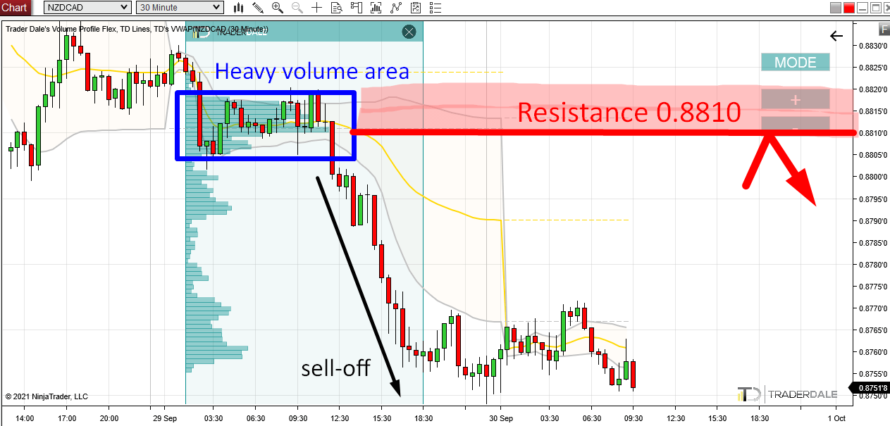
Now that we know there were strong institutional Sellers active around 0.8810 we can adapt to that.

Pullback to 0.8810

What we can do is wait for a pullback to this area (0.8810) and then trade with those Sellers once more.

This zone is clearly important for them since they placed a lot of their Shorts there so chances are they will want to trade here again.

When the price makes it back to the area around 0.8810 we can expect those Sellers to become active again and to try and push the price downwards from here again.

This should make the zone around 0.8810 a strong day trading Resistance.

This Volume Profile setup is called the “Volume Accumulation Setup“. It is my favorite Volume Profile setup and you can learn all there is about it in my Elite Pack Trading Course.

I hope you guys liked my analysis! Let me know what you think in the comments below!

Happy trading,

-Dale

Comments

Popular posts from this blog

Beginners Guide to Order Flow PART 1: What Is Order Flow?

DEFINITION: Order Flow is an advanced charting software which enables you to read all trading orders that are processed in the market. It helps to track the BIG financial institutions through the trades they make. Most people get confused when they open up a chart with Order Flow for the first time. There is no shame in that. Order Flow shows so many information and it is easy to get overwhelmed and confused if you don’t know what to look for! This Beginners Guide will teach you how to understand how Order Flow works and how you can use it in your trading! In this 1st part of the Order Flow Guide I will show you around the Order Flow interface. Footprints The Order Flow does not show standard candles, but it shows FOOTPRINTS . A footprint shows not only Open, High, Low, Close (as standard candles) but it also shows orders traded in that candle. Orders can be...

How To Trade The Point Of Control (POC)

DEFINITION: Point Of Control (= POC) is a price level at which the heaviest volumes were traded. The most important thing that the Volume Profile indicator shows is the POC. I dare say that if you used Volume Profile only for the purpose of identifying the POC, you would be a way better and trader then 99% of the retail traders. No matter what trading strategy you trade. Why do I say this? Why is POC so important? Point Of Control is so important because it shows the place where the most trading took place – where the biggest trading positions were accumulated. POC shows the BIG guys! Who accumulates those huge trading positions? The BIG guys – that’s the big financial institutions like hedge funds, pension funds, huge banks, etc… It is those BIG guys who move and manipulate the markets. It would be a huge advantage to know where they placed most of their positions, right? The good news is th...

NZD/CHF – How To Trade The “b-Shaped” Profile

Today’s intraday analysis will be on  NZD/CHF  and I will start by talking about the structure of the  Weekly Volume Profile . Weekly Volume Profile structure In the previous week, there was a  “b – shaped” Volume Profile histogram formed. b – shaped histogram means that the shape of the histogram  looks like the letter “b”. It says that the market sees the value at the bottom half of the profile while rejecting the upper half. If you look at the picture below, you can see that there was a  rotation  (Monday, Tuesday), then strong  buying activity  (Wednesday), and then an immediate  rejection and a sell-off  (Thursday). Then again a  rotation  on Friday. One of the most important things to notice in a b – shaped profile is a  volume cluster created in the rejection area. In this case, there were two of them. Such a  volume cluster  indicates a place where the  sellers were...