All eyes are on the EUR/USD again. The reason is that it broke all significant supports and it is under strong and constant selling pressure since the beginning of this month.
Is there a way to tell where this strong downtrend might stop and possibly turn?
Yes, there is! But we need to have a look at higher time frames – weekly or monthly. Why? Because we need to see the price action and volumes that were in this area in the past.
The last time EUR/USD was as low as it is now was in 2017. For that reason, we need to look into this area and try to find something to hold onto there.
Now, I am interested in how the volumes were distributed in this area. When I use my Flexible Volume profile on the 2017 uptrend, then it shows this.
EUR/USD, Weekly chart:
Yes, there is! But we need to have a look at higher time frames – weekly or monthly. Why? Because we need to see the price action and volumes that were in this area in the past.
The last time EUR/USD was as low as it is now was in 2017. For that reason, we need to look into this area and try to find something to hold onto there.
What happened in 2017…
2017 was a trend year. First, there was a few months of rotation from the end of 2016 to the beginning of 2017. Then a massive uptrend started and lasted almost a whole year.Now, I am interested in how the volumes were distributed in this area. When I use my Flexible Volume profile on the 2017 uptrend, then it shows this.
EUR/USD, Weekly chart:
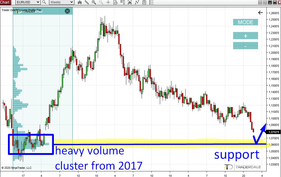
In the screenshot above you can see that I marked a significant volume cluster area from beginning of 2017.
What this tells me is that there were massive volumes accumulated there. Then the trend started.
So, we have heavy volumes at the bottom, then a gap which did not get closed and then one year of an uptrend.
Currently, after almost three years the price is heading back into this area.
What is going to happen? This is trading, we can never be sure, but chances are that there could be a buying reaction from this old volume cluster (around 1.0600).
The reason for that is that the buyers who were there in 2017 could become active again and cause another strong buying activity. This would stop the current sell-off and it could eventually turn it into a new buying activity (an uptrend).
Also the sellers who are currently pushing the price downwards probably won’t want to risk a fight with the buyers from 2017 and they will quit their selling positions.
They will most likely do so at the volume cluster from 2017.
When a seller gets rid of a short position he needs to buy (go long). This also helps to push the price upwards.
What this tells me is that there were massive volumes accumulated there. Then the trend started.
Trend started with a gap
If you look closely, then you can see, that it actually started with a gap! An interesting thing worth pointing out is that sellers were not able to close this gap! The buyers were just pushing too hard. Scenario like this is very rare and it shows the power of buyers.So, we have heavy volumes at the bottom, then a gap which did not get closed and then one year of an uptrend.
Heavy volume cluster in 2017
The buyers who started this crazy uptrend in 2017 were initially building their buying positions in the rotation I marked. From there they were pushing the price upwards.Currently, after almost three years the price is heading back into this area.
What is going to happen? This is trading, we can never be sure, but chances are that there could be a buying reaction from this old volume cluster (around 1.0600).
The reason for that is that the buyers who were there in 2017 could become active again and cause another strong buying activity. This would stop the current sell-off and it could eventually turn it into a new buying activity (an uptrend).
Also the sellers who are currently pushing the price downwards probably won’t want to risk a fight with the buyers from 2017 and they will quit their selling positions.
They will most likely do so at the volume cluster from 2017.
When a seller gets rid of a short position he needs to buy (go long). This also helps to push the price upwards.
If you
liked this long-term EUR/USD analysis, you may want to check out two
older articles, where I predicted and traded this strong sell-off on
EUR/USD:
EUR/USD short – trade description and strategy
EUR/USD short – how I made +1.600 pips on this single trade
I hope you guys liked this analysis. Let me know what you think in the comments below!
EUR/USD short – trade description and strategy
EUR/USD short – how I made +1.600 pips on this single trade
I hope you guys liked this analysis. Let me know what you think in the comments below!
Happy trading!
-Dale
-Dale
- Get link
- X
- Other Apps
- Get link
- X
- Other Apps
Comments
Post a Comment