I received
quite a lot of emails from people asking me to do an analysis on Gold. I
am not surprised by this. Gold prices are surging again and people are
getting interested (again).
Today I am going to do a big picture analysis and point out the most important support and resistance zones.
In this case, I pulled 10 years of data and printed it on the Weekly time frame.
This allows me to see the complete BIG picture.
The next thing I did was that I draw my Flexible Volume Profile over the whole 10-year area.
Result? A 10-year Volume profile with two really clear heavy volume zones. Those are the most crucial areas in the whole 10 year period!
And the most important zones in those two heavy volume areas are the places where the volumes were the heaviest. Those are the volume peaks or you can also call them “local POCs“.
One is around 1665.00 and the other is 1285.00
You can see this on the Weekly Gold chart below:
Today I am going to do a big picture analysis and point out the most important support and resistance zones.
The BIG picture
If you want to do an analysis of any trading instrument, it is always best to start from the big picture. By the big picture, I mean THE BIG picture!In this case, I pulled 10 years of data and printed it on the Weekly time frame.
This allows me to see the complete BIG picture.
The next thing I did was that I draw my Flexible Volume Profile over the whole 10-year area.
Result? A 10-year Volume profile with two really clear heavy volume zones. Those are the most crucial areas in the whole 10 year period!
And the most important zones in those two heavy volume areas are the places where the volumes were the heaviest. Those are the volume peaks or you can also call them “local POCs“.
One is around 1665.00 and the other is 1285.00
You can see this on the Weekly Gold chart below:
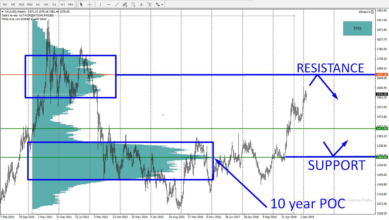
Support at 1285.00
Let me first talk about the 1285.00 area.As you can see from the picture, there was a very long rotation (2013-2016). I remember that when Gold started rotating there, people started to lose interest in it.
You know, this is funny. In rotation like this big financial institutions are building up their positions, getting ready for an action and what the rest of retail traders do? They lose interest. They get interested again only when there is a strong trend. But at this point it is usually late! This is something to think of! But let’s now get back to the topic!
So, from this long rotation price finally shot upwards. What does this tell us? That it was mostly buyers who were accumulating their positions in the rotation!
When the price re-visits this area again, it is pretty likely, that those buyers will become active and aggressive again and that they will drive the price upwards.
This is why I think that the Point of Control (POC) of this area is a really strong support.
Resistance at 1665.00
Now the price is going aggressively upwards. Lots of people finally realized there is an uptrend and that they would also like to have some piece of the cake.We who use Volume Profile know, that this idea is pretty risky.
The reason is that the price is heading towards a major volume based resistance.
If you look at the Weekly chart again, you can see that there was a strong rejection of higher prices in the past.
This means that in 2010 the price went aggressively upwards, then a rotation started (2011/2012) and then a sell-off (which ended in 2013).
There were pretty massive volumes accumulated in the rotation before the price changed its direction (2011/2012). Sellers were building up their selling positions in this rotation and then they pushed the price downwards into a new trend.
Currently, the price is getting near this heavy volume area again.
Even though it has been 8 years since the price was at those levels, I still believe that there will be a reaction.
Where exactly? The most important place in this heavy volume area is in it’s POC (1665.00). This is the place with the highest probability of a strong reaction.
How to manage such trades?
If you like this sort of long-term analysis and long-term trading, then you need to remember that for such trades you need to have wide enough Stop Loss and Take profit.I am not going to tell you where to place it, but with time frames like these (weekly or monthly) you need to let the trade breathe and develop! You cannot expect an immediate reaction.
Want to learn more?
If you found this interesting, you may also like to read another two articles I posted here about this sort of long-term trading:How To Plan Long-Term Investments With Volume Profile
A Story Of A +1,600 Pip Trade
I hope you guys like this analysis and that you found it helpful.
Have a GREAT weekend and I will see you on Monday with a new Weekly Trading Ideas Video!
I hope you guys like this analysis and that you found it helpful.
Have a GREAT weekend and I will see you on Monday with a new Weekly Trading Ideas Video!
Happy trading!
-Dale
-Dale
- Get link
- X
- Other Apps
- Get link
- X
- Other Apps
Comments
Post a Comment